
Your next customer will open you on a phone
A business site is now judged in one hand, on a small screen, often away from the desk. The phone number and the next step have to be obvious.
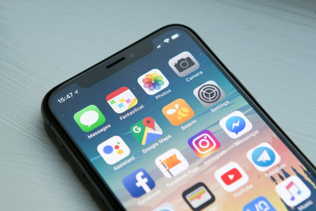
People do not wait until they are at a computer to check a business. They open the site on a phone, look for a number, and decide quickly whether to call.
Put the next step where the thumb is
The phone number, WhatsApp link and quote path should be visible without a hunt. A beautiful page that hides the contact details is a brochure, not a working site.
Keep the page light
Large unused pictures and heavy animation make a phone work harder than it should. Type, spacing and one clear picture are enough for most service businesses.
Use the real identity
The colours, the logo and the address should match the business a customer already knows. This website is the standard Edgepoint builds to: sky blue, white, and a way to reach a person.